
The recipe calls for a vibrant coral hue, but all you have in your cabinet are primary colors. Before mixing begins, here’s what you do: Avoid staring at the white frosting bowl with dread. Because food coloring act more like chemistry than paint, it can be simple to mess up by adding too much color. You’ll want to mix the right ratio to keep from ruining a whole batch.
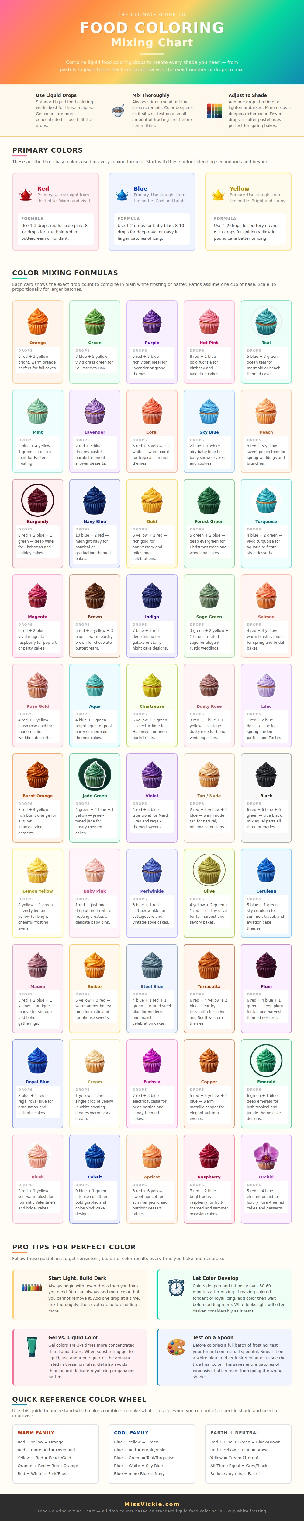
The chart shows how careful proportions of each color make all the difference between muddied or true-to-color results. Yellow, blue, and red are building blocks of all other shades. When you’re using them directly from the bottle, stick to this trio until you gets to your preferred level of saturation. This is where restraint comes in… We tend to think we’ll use more drops then we actualy will.
How to Mix Food Coloring Like a Pro
How do you achieve pale pink? One drop of red in a cup of frosting. You can transform white into color. You don’t need much pigment at all. However, standard liquid red dye can be both muddy and/or turn orange, since most red dyes has yellow undertones. If you’re aiming for deep crimson, you’ll need to add enough red and wait for it to take.
Mixing these basic colors help make sense of it all. Purple and green fall into predictable patterns. However, knowing the exact drops is far more important than some vague guidance. Blue + Yellow = Green; the amount of each give you the final color. More blue = Teal, more yellow = Lime. Knowing specific numbers eliminates guesswork (it’s like baking).
There’s no haphazard stirring here. Instead, you’re following a recipe, considering how dye and fat/sugar works together. To make pastels, keep in mind that food coloring is sold as liquid or gel concentrates rather than a white paste. Also, no amount of white dye can lighten darker colors. So you work with just a drop or two of color in a big pot of white base.
For example, “lavender is made by combining three drops of blue and two of red to achieve a delicat shade,” the chart says. That’s why so many folks fail here. Thinking they’ll dilute pink with purple, then end up with muddy gray. By sticking to direct mixing of primary colors, your hue remain vivid and clear.
And finally there’s timing factor. As the color sits on top it will darken, and while something might seem too pale at 5 minutes it could be just right at an hour. It takes time for the pigment to mix with structure of the sugar or butter. For every drop of liquid coloring you’ll use about a quarter that much gel (which is super-concentrated). That’s why gel works well; it doesn’t contribute any additional moisture to the frosting, which can mess up consistency.
Remember: Before committing to that full bowl, always test it out on a small spoonful first. It’ll save you from wasting a whole batch of buttercream. Mix up a little, wait a few minutes to see actual color, and then adjust accordingly by adding another drop (if too light) or some additional white base (too dark). When you get the right color in the small sample, scale up to large bowl.
Working with food color is a precise science that takes time. Knowing properties of the primary colors will eliminate the need for many bottles in your kitchen. Getting the right proportions and planning ahead makes it possible to turn that white frosting into whatever color you dream up. No more stress; just decoration.