
Buttercream: What’s wrong with this picture? You mix up some buttercream and notice that it isn’t white, it’s…murky. This is a problem that plagues many people, typicaly just before a deadline. It doesn’t mean your eyesight is off, or even your sense of color; it means you don’t yet know the difference between normal dyes and neon pigments. The latter are intense but used in low volumes. So the same rules that govern your blueberry muffin coloring don’t hold true here.
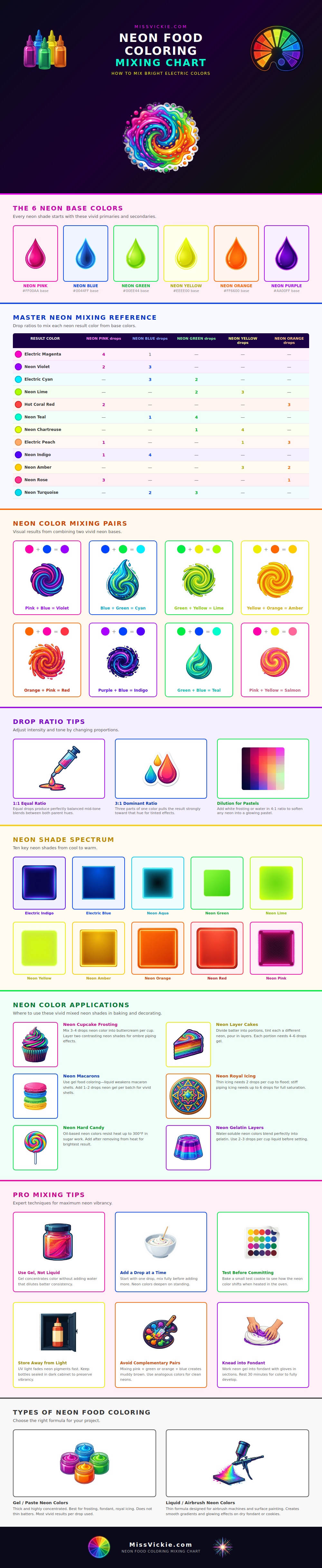
These are base colors. A good bright mix begin with base colors. To start, neon color are hard to use as a base. You want vivid primary and secondary colors. The infographic outlines the six must haves for bright color mixes: sharp purple, vivid orange, fluorescent yellow, neon green, electric blue, and hot pink. These aren’t your average grocery store dyes. These are concentrated pigments that maintain their brightness so you won’t have to water them down in your batter. Start with a muddy brown or dull red, and even mixing won’t fix it. Get the intensity right from the bottle.
How to Make Bright Neon Colors
Where most folks gets tripped up is understanding the ratio. This chart does a great job breaking down exact drops used to create certain shades of secondary neons (e.g., deep violet; true cyan). For example, neon teal prefers more green then blue and electric magenta needs a lot of pink with only a hint of blue. This is due to the varying staining power of each neon color. Because of this natural strength (blue pigment is stronger than yellow), one-to-one mixes tend to be dark mess instead of a bright new color. To balance out this natural strength difference, the guide offers examples like cyan, which should of been made of three drops of blue for every two drops of green.
Then consider this: What are you coloring? If you’re looking for vibrancy but don’t want to alter your recipe’s chemistry, then you’ll want to use gel food coloring only. Liquid dyes add water, which can curdle frosting or make cake batter too wet. Gel paste won’t thin out. There’s no liquid to dilute the pigment so the concentration remains high. That’s why we emphasize gel formulations in all of our examples on the chart. Especially when it comes to fondant and royal icing.
Timing is more important. The longer a neon color sits, the deeper it will become. I’ve had a pink mixture that was really pale in the bowl but then bloomed into some hot magenta after an hour in fridge. That’s what throws novices off because instead of waiting, they just keep going back in and adding more drops… until they end up with brown. Add one drop, wait. Add another drop, wait. It’s all about patience (the secret ingredient).
Rushing the mix? You’re wasting your whole batch of frosting by trying to fix a color that hasn’t developed yet.
And then there’s storage. If they’re stored near sources of UV light (such as sunlight), those vibrant colors degrades rapidly. The chemical makeup of the dye stays the same if kept in a dark cabinet. When the pigment breaks down, there’s no going back. Now you’ll have to use twice as many products and still get only half the results you used to get.
Lastly, for tidy results, do not mix complements. Mud = pink + green. Brown = orange + blue. Aim for clean analogous combos from the color wheel, for that glowing effect. Use the chart above as a ratio guide before you start. Bake a small test cookie to see how heating the dough change it, then go at it confidently.
Nobody will know these are made in your sad home kitchen…they’ll think they’re pro desserts.